Spring 2021 Color Palettes
February 10, 2021
Laura Rooker
Hey there!
Welcome to my post introducing some of the color schemes I’ll be using in upcoming spring designs! When it comes to design and color palettes, I don’t necessarily follow the “trends” that are projected for upcoming seasons; I’m a firm believer that we create our own trends based on what we like! And that’s exactly what this post is: colors that I think work beautifully together and wanting to share them with my readers for whatever design/creative work you may want to create!
One of the looks that I really love is using earth tones with a pop of brightness or neon. You’’ll see in some of these palettes (jungle and melon) that one of the colors stands out a little more to create that effect. Another color concept I love and think works well all year round are neutral colors- (you’ll see them in the almond palette) and can also check out another of my posts on neutrals entitled Beautiful Pastel Color Palettes.
Included in the palettes are the hex codes so if you’re using creative programs like Photoshop or Canva, you can simply enter them right in! Enjoy 🙂
The Almond Palette
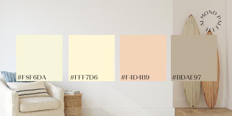
The Almond Palette is really intended to be used all year round! It doesn’t matter whether you’re creating artwork for a beach home, or a flyer for a hiking excursion- this palette is perfect to be used for any project.
The Plum Palette
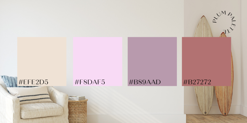
The Plum Palette includes one of my very favorite colors- mauve! (#B27272) It can be used all year round as well!
The Jungle Palette
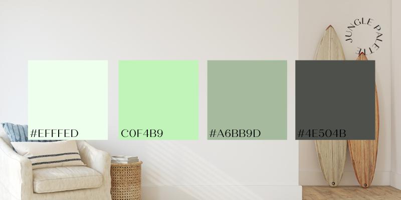
The Jungle Palette incorporates my favorite design color combination- earth tones with a pop of neon! #C0F4B9 is not quite a “neon” green, but it definitely pops out from the other colors.
The Melon Palette
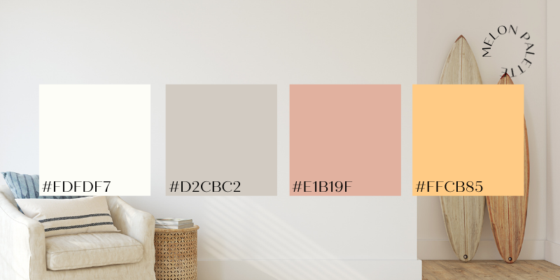
The Melon Palette incorporates a pop of orange! These colors go really well together because they’re neutral and also bold in one palette but compliment each other. You can create any beautiful design with this palette!
The Cotton Palette
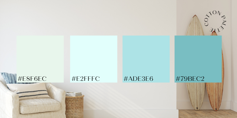
The Cotton Palette reminds me of a bright and beautiful day in the spring time. The sky is blue, the grass is getting green, and spring is in the air!
Thanks again for reading today’s design post! I hope it inspired you to go out there and create something new with spring vibes in mind!